


I built a website for almost no one. A case study of MiYork Education
And why letting everyone else leave was the whole strategy MiYork needed
July 20, 2025
.webp)
Welcome to The Deep Clients. We break down the work behind brands that grow by resonating deeply, not reaching widely. Real projects. Real decisions. The principles that attract people who don't just buy from you, but invest in your vision and bring others like them. And you can build yours.
Select your clients. Select your future.
They came to me wanting to look like everyone else.
MiYork is a study abroad community in Vietnam. Founded by young international students and researchers, they help Vietnamese teenagers build portfolios, social impact projects, and university applications for top global schools.
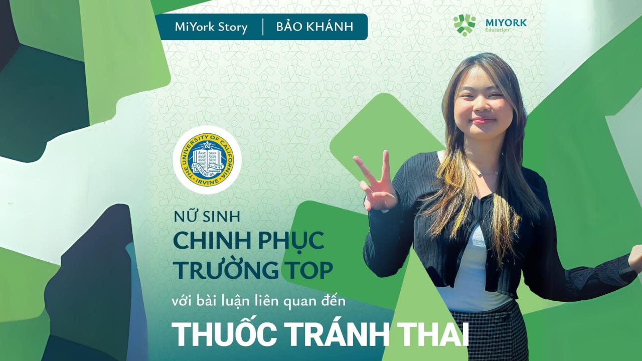
One of their founders is Vừng (An Lê), a young influencer I already knew of her inspiration for thousands youngsters to go study abroad and discover the world.
When they reached out, their only web presence was a self-made Google Site. Plain. Unpolished. But I could feel something underneath it. They weren’t performing for the internet. They were trying to express themselves as ordinary people doing something they believed in. Most organizations try to look bigger than they are. MiYork was the opposite. They were bigger than they looked.
They sent me references. Mass-market education websites. Broad. Service-listed. Corporate-feeling. “Make ours look like this.”
I understood the instinct. When you don’t know what makes you different, you copy what seems to work for everyone else. It feels safe. It feels professional.
But it would have buried the very thing that made them valuable.
The thing they couldn’t see from inside
During my research, I discovered something the founders hadn’t fully recognized: MiYork had almost no direct competitors in their specific niche.
They weren’t a mass-market study abroad agency. They were a community of young people helping other young people who want to change the world, not just get a degree overseas.
Saying in another way, almost young students aren’t their best-fit audience, only ones who are truly curious about the world and have willing to create social impacts are.
None of that came through online. Their instinct was to present themselves the way every other study abroad center does. To blend in with a category they didn’t actually belong to.
I pushed back. Not in one dramatic conversation. It was gradual. Multiple conversations, slowly showing them that mimicking the mass market would dilute what made them special. Their audience wasn’t every teenager who wants to study abroad. Their audience was a specific kind of teenager. One with empathy for social problems, a desire to explore and create impact, whose parents have the means to support overseas education.
When I was a teenager in Vietnam, I wanted to study abroad too. My family didn’t have the opportunity. So I understood what MiYork’s students carry. Not just ambition. Longing. I didn’t need persona documents to feel who this site was for. I had been them.
(of course I still did market research during the project)
These kids don’t choose MiYork for logistics. They choose MiYork because it feels like their tribe.
That realization changed the entire direction of the project.
Building for belonging, not for everyone
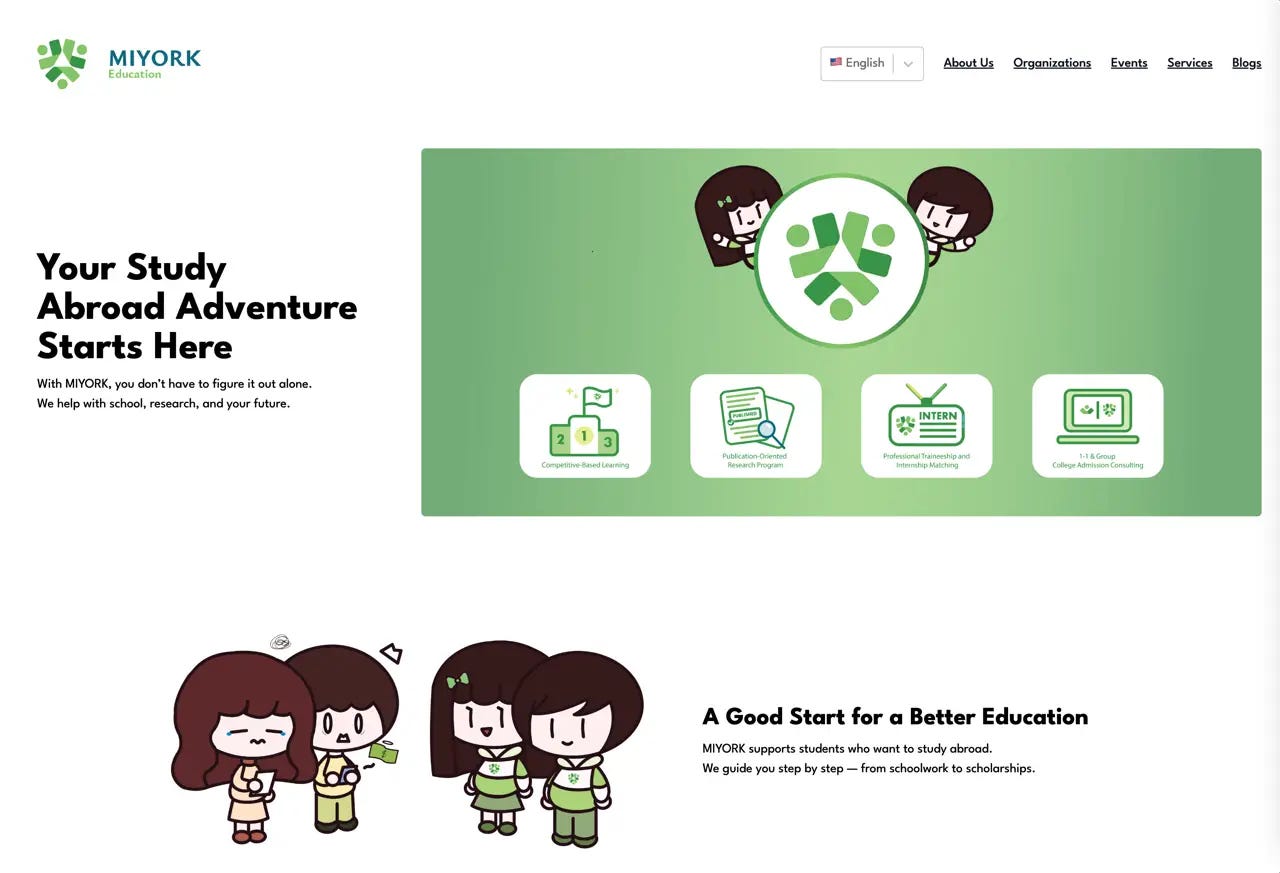
Instead of building a website that explains services, we built an environment where the right teenager visits and immediately thinks: “Oh, lovely. This is exactly my tribe.”
I started the project by seeking to understand MiYork’s vision as young individuals, not as a corporate entity. Because behind the request of building website is the need of expressing truly themselves into the online world, not showing up something to catch attention.
That distinction shaped every design decision.
Most designers would have built something clean, structured, trustworthy in the conventional sense. I internalize their vibe and undoubtedly treated the website like a cartoon. Like an intimate blog for a tribe of youngsters who want to make a social impact.
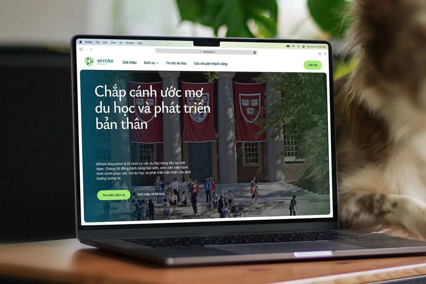
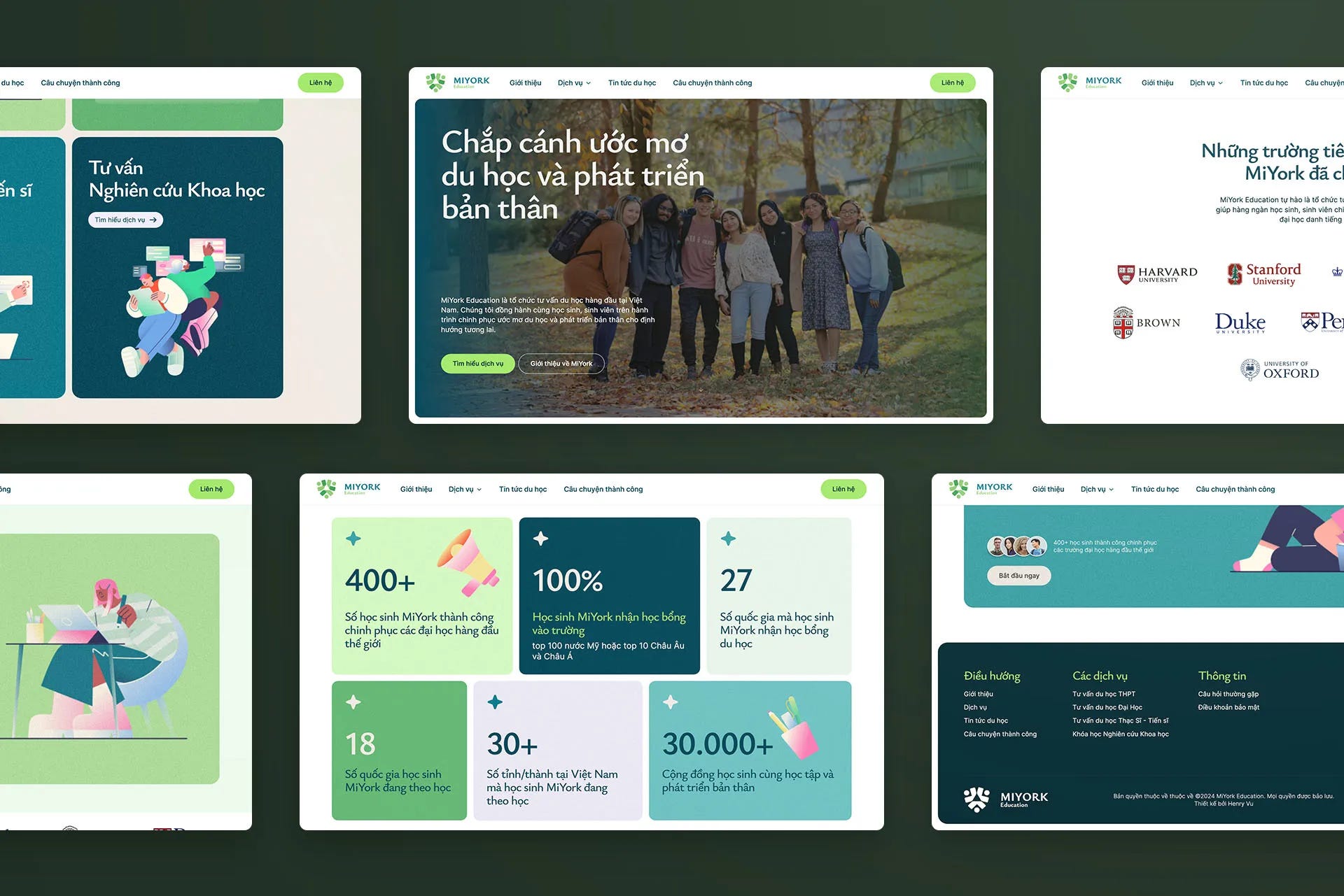
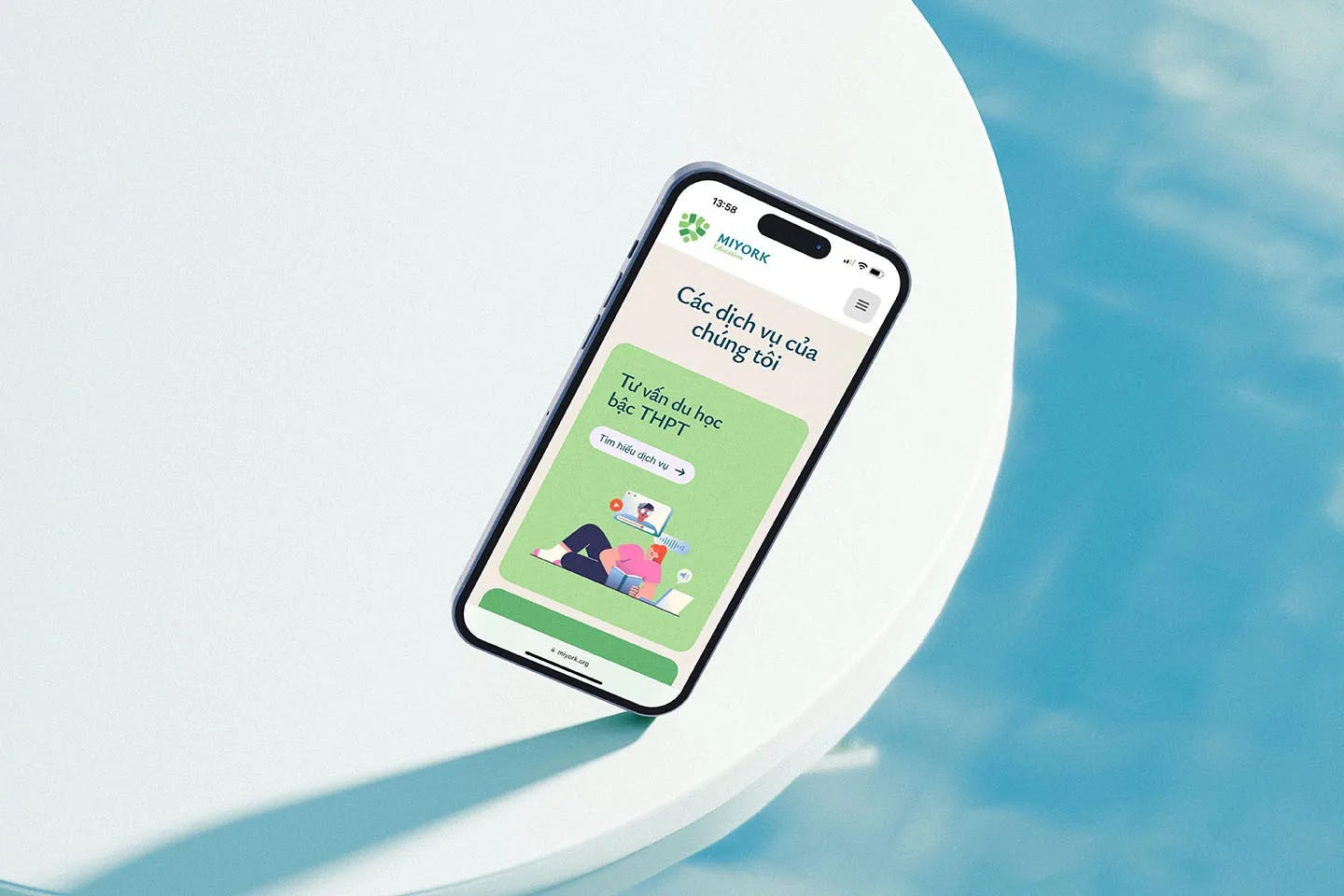
Playful fonts. Fresh color palettes. Illustrations throughout the site that bring meaning to each section rather than relying on stock imagery. Large-scale design elements that make the experience feel friendly, cheerful, and alive.
And the most important essence is, I kept the whole look unpolished, with a little bit messy as we’re still young, and we need errors and accept our flaws to grow.
The essence I was designing for: no hierarchy. No mentors or seniors teaching lessons to the youth. Everyone is a youngster together, trying to improve themselves and build a community. When you visit, you feel like you are part of something. Not like you are being sold something.
Because I could feel their energy as if I were their own audience, I was able to translate it into specific design choices without needing a heavy illustration phase. The design came from understanding, not from process.
The deliberate trade-off: if you’re not the right audience, if you’re a parent comparing five agencies on price, or a student looking for the cheapest visa path, the site might feel too casual.
But for the right student, it signals belonging instantly.
That polarization is the filter working.
None of this means the craft was loose.
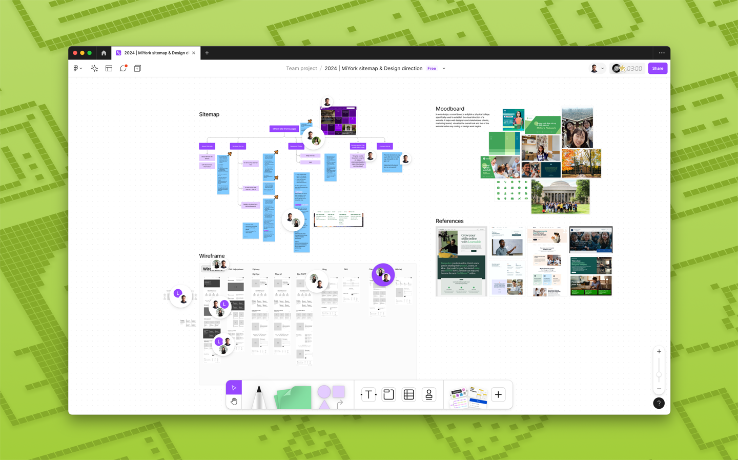
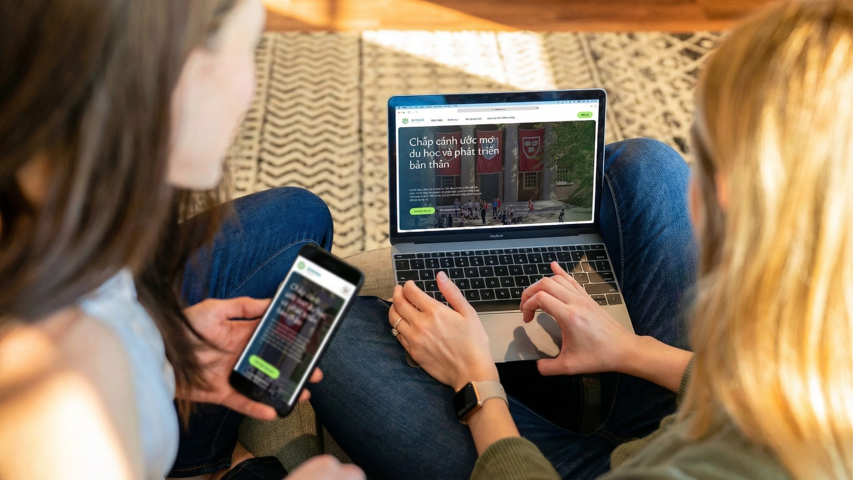
The site was built on Webflow. The initial build took three weeks, followed by four weeks of feedback and refinement. The collaboration was lean. Not because we rushed, but because understanding was already there.
Underneath the playful surface, every technical detail was precise:
- Clear site structure so the right students could find MiYork through search, not just through social media
- A content system the founders could manage themselves without needing a developer every time they publish a new story or update a program
- Fast load times and clean responsiveness across devices
- SEO foundations that let MiYork’s depth become discoverable over time, not dependent on constant promotion
A website that feels alive but breaks on mobile isn’t a filter. It’s a frustration. The craft has to be invisible for the feeling to work.
What endurance proves
The website I built 2 years ago is still their live site today at miyork.org. The positioning, structure, and design philosophy I created have remained the foundation of their brand for years. Nothing has been scrapped or redesigned.
Shallow work gets redesigned. Deep work endures.
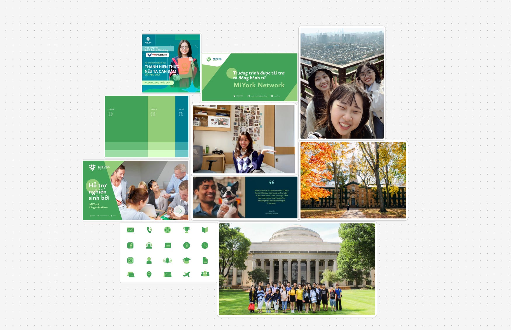
Since the website launched, MiYork has grown into the top of their category. Over 300 students admitted to top-100 world universities, including Harvard, Oxford, Cambridge, and Stanford. Their team has expanded to 30+ international mentors, with MiYork’s work directly benefiting 500 students and indirectly reaching 80,000.
They grew not by chasing the mass market, but by going deeper into the specific segment we identified together. The website became the platform where that depth could be communicated, explored, and trusted.
What these words is really about
If something in this story felt familiar, if you sensed yourself in MiYork’s position, wanting to express who you really are but defaulting to what everyone else does, I’d love to have a conversation.
Not a sales pitch. A real conversation about your business, your presence, and where your website might be quietly attracting the wrong people or pushing away the right ones.
You don’t need to look like everyone else. You need to look like yourself, clearly enough that the right people recognize it.
They’re out there. They’re looking for someone who sees things the way you do.
They want you more than you want them.
Your website just needs to help them find you.
— From Hieu Vu with <3